As more business owners adopt ecommerce to grow their business, the competition for an online customer’s attention and loyalty is no longer that easy. With the proliferation of brands online, satisfying customers and delivering a purchased product online only meet baseline expectations. This makes ensuring loyalty among customers more complex and demanding.
To be able to stand out, you need to build a total brand and customer experience that goes beyond the checkout process. This means ensuring a post-purchase customer experience worthy of being talked about among friends and peers.
Delighting your customer at every touch point especially at the last touch point is a smart way of driving customer engagement and developing sustainable customer relationships that will ultimately help grow your business.
Having said that, following the release of our Department Stores Online Checkout Usability Report, this post explores the post-purchase experience of the five department stores online sites included in the said report.
Let’s begin!
The Analysed Ecommerce Sites From the Report
- The Warehouse – www.thewarehouse.co.nz
- H&J Smith – www.hjsmith.co.nz
- Ballantynes – www.ballantynes.co.nz
- Farmers – www.farmers.co.nz
- Smith & Caughey’s – www.smithandcaugheys.co.nz
Know more about the Department Stores Online Checkout Usability Report here.
The Good, The Bad and The Ugly
1. The Warehouse
|
The Good
|
Received order confirmation email shortly after checking out |
| Order confirmation email included the customer service information and a link to their Facebook account | |
| Received a shipping confirmation email the next day which included the tracking number and estimated arrival date | |
| Received the item on time | |
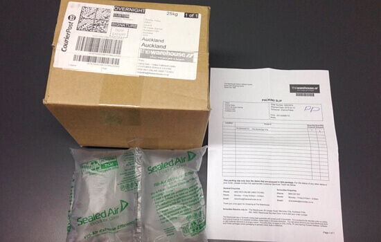
| Name of the company was on the package (sticker) | |
| Included the packing slip with customer service and returns information inside the package | |
| Included a sealed air inflatable packaging | |
| Received a customer satisfaction survey email 10 days from purchase date | |
|
The Bad
|
No thank you note |
| No return form or return postage label inside the package | |
| Order and shipping confirmation emails had different email layouts | |
|
and The Ugly
|
Confirmation emails didn’t include company branding |
| Order confirmation email didn’t include product recommendations or special discounts | |
| No company branding on the package |
2. H&J Smith
|
The Good
|
Received order confirmation email shortly after checking out |
| Order confirmation email included their toll free number and social media links | |
| Received the shipping confirmation email on the same day | |
| Received the item on time | |
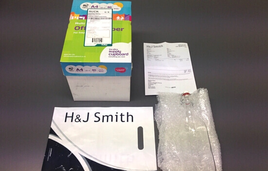
| Included a sealed air inflatable packaging and bubble wrap | |
| Included the invoice, returns instruction and returns forms inside the package | |
| Item was inside the company branded plastic bag | |
|
The Bad
|
No indication of estimated arrival date in the confirmation emails |
| No tracking information in the shipping confirmation email | |
| No thank you note inside the package | |
| The packaging was a recycled office paper box. The office paper box branding wasn’t covered. There was only the postage label with the company name in the ‘From’ section. | |
|
and The Ugly
|
Confirmation emails didn’t include product recommendations, special discounts or surveys/ customer feedback |
| Confirmation emails have no brand personality or tone of voice and only had the company logo | |
| No company branding on the package |
3. Ballantynes
|
The Good
|
Received order confirmation email shortly after checking out |
| Order confirmation email included the estimated dispatch date and links for – order tracking, Facebook, events information, delivery information and gift cards | |
| Received the shipping confirmation email on the same day with the order tracking link | |
| Confirmation emails included site navigation links on the email header; they didn’t include all the categories from the site and included only three links – homepage, events/ news and offers/promotions | |
| Received item the next day | |
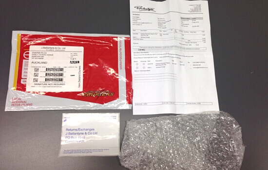
| Included the returns postage label inside the package | |
| Included the thank you note, customer service information, invoice, returns and exchange information and forms inside the package | |
| Item was wrapped in a bubble wrap | |
| The Bad | No indication of estimated arrival date in the confirmation emails |
|
and The Ugly
|
Confirmation emails didn’t include product recommendations, special discounts or surveys/ customer feedback |
| Confirmation emails didn’t include company branding | |
| No company branding on the package |
4. Farmers
|
The Good
|
Received order confirmation email shortly after checking out |
| Order confirmation email included their customer service information and social media links | |
| Received the shipping confirmation email the next day with the order tracking link | |
| Subject line of the confirmation emails had a more personal touch compared to the emails from the other department stores online.Used “Thank you for shopping at Farmers” and “Your Farmers order is on its way!” instead of the usual “Order #…” | |
| Received the item on time | |
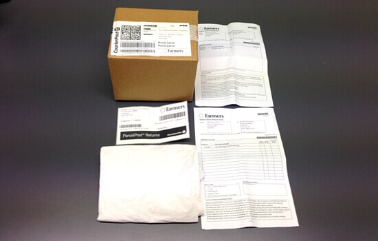
| Included tissue paper and sealed air inflatable packaging | |
| Included the customer service information, return information, postage label and form inside the package | |
| The Bad | No indication of estimated arrival date in the confirmation emails |
|
and The Ugly
|
Confirmation emails included the main navigation of the site’s homepage but the categories were written too close to each other and lacked the needed whitespace in between them. This overcrowded the email header. |
| The shipping confirmation email had poor email layout with the content not aligned properly | |
| Confirmation emails didn’t include company branding | |
| Confirmation emails didn’t include product recommendations, special discounts or surveys/ customer feedback | |
| No company branding on the package |
5. Smith & Caughey’s
|
The Good
|
Received order confirmation email shortly after checking out |
| Order confirmation email included their customer service information and links to their returns, delivery and privacy information | |
| Order confirmation email included the estimated arrival date | |
| Received the shipping confirmation email the next day with the order tracking link | |
| Confirmation emails included some of the site navigation links in the email header | |
| Received the item on time | |
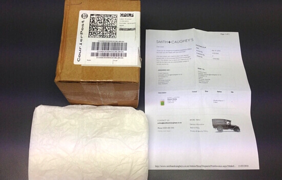
| Item was wrapped with tissue paper | |
| Name of the company was on the package (sticker) | |
| Included the thank you note, invoice, return and exchange information inside the package | |
| The Bad | Indicated in the invoice that there was a returns and exchange form inside the package but there was none |
|
and The Ugly
|
Confirmation emails didn’t include company branding |
| Confirmation emails didn’t include product recommendations, special discounts or surveys/ customer feedback | |
| No company branding on the package |
Stop Satisfying Customers and Start Wowing Them!
A important part to wowing customers is to exceed their expectations. There are many things that you can do to leave your customers with that awesome feeling of happiness. You can do something as simple as inserting a hand written thank you note or including goodies and treats inside the package. To WOW customers is to add more value to their experience of your brand beyond the product itself.
The department stores online sites shared some of the good, the bad, and the ugly practices from the online shoe sites and sports equipment sites. Below are some of the practices we found from the department stores online post-purchase experience review worth noting.
Received the order and shipping confirmation emails soon after the transaction
Receiving confirmation emails reinforces the acknowledgement of the transaction in the confirmation page by providing your customers with an electronic record of their purchase assuring them that their transaction was successfully completed. It also helps them feel confident by giving them a sense that something is happening. By not sending the emails soon after they have completed the purchase can make them think that something had gone wrong, thus creating unnecessary anxiety. That’s a no no if you want to encourage repeat purchases or retain your existing customers.
Used protective stuffing or cushioning (fillers)
Most of the department stores online used some form of protective cushioning such as sealed air packaging, bubble wrap and tissue paper to ensure a safe transport of the product. These are common and traditional options used by most ecommerce businesses. You can think outside the box by creating a more memorable branded packaging by using custom printed or colored tissue paper, colored crinkle paper, cotton inserts, biodegradable packing peanuts, excelsior or metallic shreds.
Asked about the shopping experience
Only The Warehouse sent a customer satisfaction survey email after the transaction. Asking your customers about their experience shows that you want to understand that will make them happier and learn about areas where you can improve.
Customer surveys or feedback can provide valuable insights into the needs of your customers – what works, what’s missing, what’s preventing them from converting or purchasing again. You’d be surprised that even the most apprehensive customer will bluntly tell you what is good, bad and ugly about the shopping experience.
Be sure to get their feedback soon after their purchase (one or two weeks later) so that your customers can still remember the experience and give you useful inputs that you can implement straight away.
The confirmation email header closely matches the site header
Ballantynes, Smith & Caughey’s and Farmers included the site navigation links on their email headers. However, with Farmers, the categories were written too close to each other and lacked the needed whitespace in between them. This overcrowded its email header making it difficult to read and navigate around. On the other hand, Ballantynes and Smith & Caughey’s included the most popular category links and had enough whitespace in between them.
By having the email header closely matching the format and styling of the site header, your customers can easily find the information they need and take action. It’s also a more subtle and better way of encouraging them to go back to your site without the need for a big CTA (call-to-action) forcing them to ‘shop now’, especially right after they’ve purchased from you.
No email personalisation and no brand personality in the confirmation emails
None of the department stores online personalised their email subject lines. Most of them simply used the order confirmation number in the subject line. Farmers did a little bit better by adding a personal touch and used “Thank you for shopping at Farmers” and “Your Farmers order is on its way!” instead of the usual generic subject lines.
As mentioned in the previous post, your customers will open the confirmation emails regardless of what the subject line is as they are expecting to receive information about their purchase. If you want to wow your customers, confirmation emails are another opportunity for you to get creative and keep them excited and confident about their purchase. Make your customers a part of your brand and strengthen the relationship already established from their initial purchase.
Poor confirmation email layout and design
Two of the department stores online had confirmation emails with inconsistent brand look and ugly lay out. Most ecommerce businesses send out emails which use plain text, boring copy, unattractive design and don’t showcase the brand’s personality effectively.
If you want your confirmation emails to stand out and to train your customers to open your future emails, you need to make them visually appealing. Aim for a clean, easy to ready and minimalist design. Your logo should be prominently displayed and all throughout the email, the fonts, colors, styling and language used should reflect your brand.
It is equally important to reflect your brand consistently. If you have a clean and consistent brand look, your customers will safely assume that is also the way by which you operate or handle their transactions. You will look much more legitimate and provide a better experience if you put some effort into branding your confirmation emails appropriately.
Are you ready to create that wow customer experience?
In this world of the post-purchase relationship, your ultimate goal is to find ways to continue delivering value to your customers after their first purchase.
And to truly wow them you need to exceed their expectations and create out-of-the-ordinary experiences that they want to tell people about and that inspires them to recommend you to others. Want to chat more on how to win customers and create a measurable difference in their experiences? Give us a call today at +64 9 9201740 or quickly fill out the form at the bottom of this page and someone from our team will contact you.
